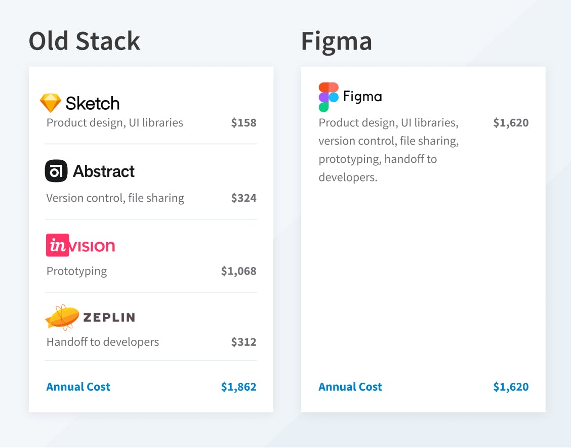
The Vynyl Design Team set out to upgrade our tools from a combination of Sketch, Abstract, InVision, and Zeplin to Figma—a highly touted design tool that would replace our old tech stack with a single integrated solution.
Our old stack worked for traditional product design, but our team was embracing component-based Design Systems and we were beginning to feel constrained by the tools. We couldn’t ignore that Figma’s capabilities were better aligned with our new design direction.
This is why and how we transitioned to Figma—and what we learned along the way.
Why Switch?
As a team, we had become accustomed to the imperfect methods of our design process. We were able to produce high-quality designs, communicate decisions to product teams, developers, and clients, and to build realistic prototypes—but not without friction and some necessary redundancy as we moved information between multiple, unconnected systems.
Tool Overload
Using a stack of tools made updating design files and prototypes a cumbersome process. A single design change meant that change also had to be uploaded to the prototype in InVision and committed to Zeplin for the development team. Updating designs across multiple platforms was a lot to maintain and often resulted in files becoming out of sync across tools.
Shared Libraries
Designers were also working from multiple, unmanaged Sketch libraries. Unfortunately, we found the process of sharing libraries via Sketch Cloud to be inconsistent at best. There were just too many problems; changes wouldn’t sync properly or in a timely manner and it was hard for our team to trust that they were working with consistent and correct assets.
Collaboration
Our design team is fully remote so the idea of being able to collaborate within a tool is very appealing. Commenting features are nice, but we ran into constraints with Sketch when multiple designers were making changes to the same design file.
File Sharing
Because our team is distributed, sharing files is mission-critical. Our previous stack wasn’t seamless enough, and it was difficult to have confidence that everyone was working from the latest versions.
Frustrated Engineers
Our disparate stack of design tools wasn’t only frustrating for designers. It was also challenging for developers to obtain the information they needed. With no access to Sketch libraries they had zero insight into what our design team was designing. They had to rely solely on Zeplin being up-to-date, which wasn’t always the case.
The Transition to Figma
Plan Research
We started by researching Figma plans to determine which tier would be the best fit for Vynyl. Because we are a product development firm and we service a diverse range of clients, the Organization Plan was the best fit. It allows us to have an unlimited number of Teams so there’s plenty of room for new and existing design work.

Our File Structure
We made the decision to only transition in-progress design projects to the new platform. Anything already completed in Sketch remained in Sketch. But first, we needed to set up our workspace and decide how we would structure clients, projects, and files.
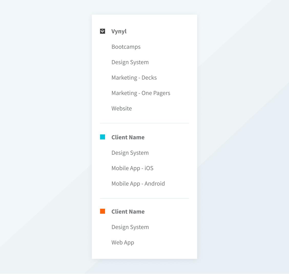
After testing a few structures for organizing in Figma, we landed on the following.

- Each client is represented by a Team in Figma.
- Each Team has a Design Systems Project that can include any of the following files based on the specific organizational needs.
undefinedundefinedundefinedundefined - The remaining Project files are based on the type of design work we’re doing for the client. They might include Website, iOS App, Android App, Marketing Collateral etc.
Importing Files
We were excited about the ability to upload Sketch files directly to Figma, but found that the designs and component relationships didn’t translate seamlessly. It became clear that starting from scratch with our libraries would be the best solution and we also took advantage of the opportunity to improve our documentation and consistency.
We made sure every reusable element had a style or component applied to it and meaningful documentation. Gone are all the one-off font treatments or not-quite-right grey colors. Our team also worked to make our components smarter and more flexible. We eliminated unnecessary bloat and leaned into new Figma features like auto layout and instance swapping to create dynamic components. The result was fewer individual elements in our Design System that were able to be used in more instances.
Figma Bootcamps
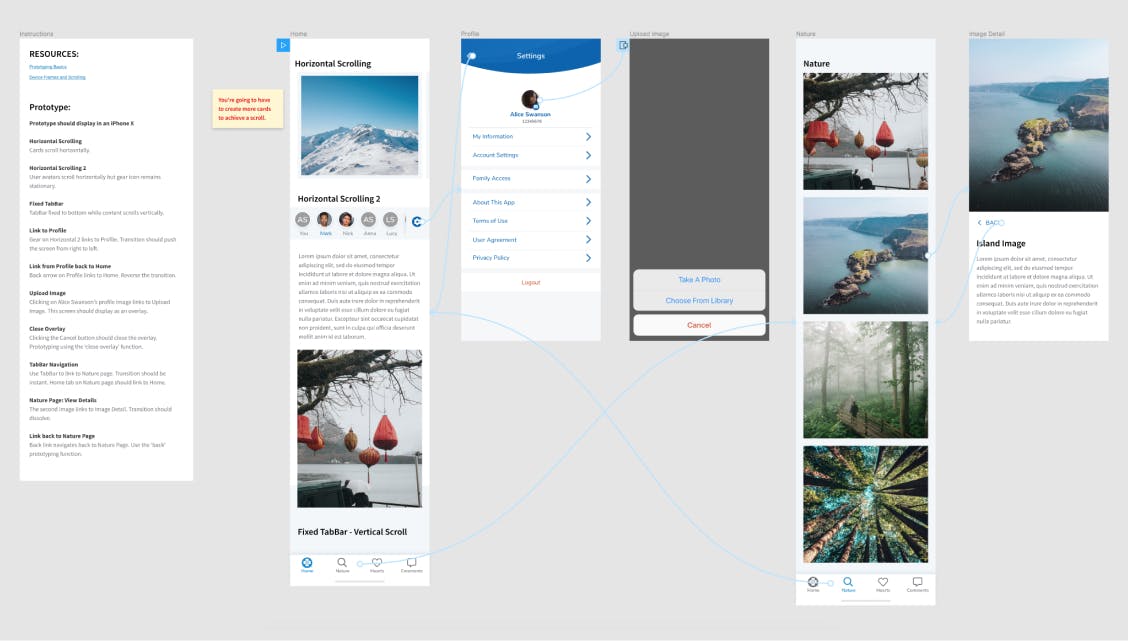
To familiarize our designers with the new features in Figma, I put together a series of Bootcamp exercises. I created templates to explore how to get the most out of auto layout and acquaint the team with new processes like prototyping. Along with the template, each designer was given resources and a set of instructions to follow. It was up to each individual to replicate the behavior of the Bootcamp template but figure it out on their own.. We went over the results and any questions or feedback in our bi-weekly design meetings.

The Result/Takeaways
The Vynyl design team has been working in Figma for several months now and we haven’t looked back. It’s an amazing tool, and frequent feature additions give us confidence that it will continue to work well for our team. Our clients are also reaping the benefits of Figma as our new workflows have increased efficiency and allowed us to work with even faster turnaround times.
Here’s what we have found most beneficial about Figma, as well as the new challenges we have adopted.
Benefits
Real-Time Design Collaboration: Instead of sending design files back and forth via Slack, Figma allows our designers to work together in real-time. Everyone has immediate access to the most recent designs.
Designer/Dev Collaboration: Figma allows your team to have unlimited viewers which means developers can export assets, access code, and see updates without having to pay for a seat.
Single Tool: With Figma, we design, prototype, collaborate with developers, and manage versions within a single tool. We no longer have to guess whether designs are up to date in multiple places.
Version Control: We are often responsible for maintaining different versions of designs, so built-in version control was a huge plus for our team. You can choose to save your work and document it at strategic points, but even if you don’t, Figma auto-saves versions for you. We’re big fans.
User Permissions: User roles and permissions allow you to get as granular as needed when granting access to projects and libraries.
Prototyping Flexibility: Figma makes it easy to include micro-animations and scrolling in prototypes—allowing us to provide our clients with an even more realistic experience.
Shared Libraries: Being able to quickly share libraries across users and projects has kept everyone in sync. Our team uses Figma in the browser so library updates are instant.
Component Descriptions: Adding documentation directly to components helps keep designers and developers aligned on usage without having to reference a separate file.
Auto Layout: Auto layout is a game changer. It allows you to create components that adjust to content changes, resulting in a much more flexible and reusable UI element.
Challenges
- Because Figma doesn’t allow you to link prototypes between pages, we had to restructure how we thought about our design files. We took a more workflow oriented approach rather than a screen-by-screen approach.
- The prototyping feature currently doesn’t include hotspot templates which means if you have a navigation menu or a tab bar that always links to the same place, you have to manually connect all those links.
- Figma uses an assets panel to add components to a design. This new way of sorting components took some getting used to as some of our team members preferred the dropdown menu approach in Sketch.
We are very happy with our migration to Figma. It has streamlined our design process and improved our ability to serve clients. We’re also looking forward to ongoing improvements from Figma that will help us continue to innovate in our designs.